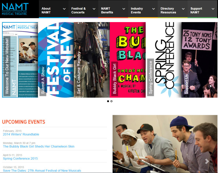
I feel (and some of you may, too) like I’ve been talking about our new website forever. We’ve known for at least two years that our old site was nearing the end of its lifespan, and started making necessary arrangements. Bidding for developers started almost a year ago. The Board approved our plan last spring. The design process began over the summer, then got put on hold because, as you may have heard, we get a little busy in September and October. There was a flurry of intense activity in November and December in which concepts became reality, we learned what did and didn’t work, what changes for change’s sake sounded great but weren’t, the old words and images made their way to the new pages, and our amazing developers, Nick Keenan and his team at NickXD, worked their butts off to say yes to nearly every “what if” and “wouldn’t it be cool?” we threw at him. Then holiday break and another pause. So close! And finally, shiny and new for 2015!
(Click on any images in this post to view them larger.)
I couldn’t be prouder to share the new namt.org with you all. It was designed with our members, Festival alumni and supporters chiefly in mind, as well as our expanding concert series and programs for the theatre-loving public. How can we make it easier for you to find the resources you need? How can we simplify? What information do you need the most? What member benefits were hidden away behind too many menus and clicks, now front and center?
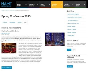
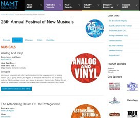
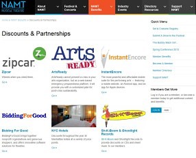
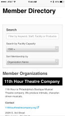 The new site is fully mobile adaptive, resizing itself to any screen size (if you’re on your computer now, change the size of your browser window to see it in action—it’s fun!) and working beautifully on your smartphone. Now, instead of a paper Little Black Book, which was typically out of date before we got it back from the printer, you’ll have a complete, always accurate membership directory in the palm of your hand at all times, along with event agendas, attendee lists, maps and more. We’ve made videos of past events and webinars easier to access, and if you ever forget your login information, it’s now just a click away. There’s also an increased focus on our members and alumni, through photo galleries and the brand new blog you’re reading right now, so send us your updates!
Plus, it’s really pretty.
Play around and let us know what you think. It’s designed to stay flexible to change and grow with us and our membership, so your feedback will help us very much. We think you’ll like it as much as we do!
Adam Grosswirth
Membership Director


